Visualizing Uncertainty in Maps
One of my main research topics is the impact of climate change on soil erosion. I often apply an ensemble of climate models to account for the uncertainty in the future climate projections. In this way, I can determine how (un)certain the soil erosion projections are, of course, after applying a statistical test. But how can you visualize this uncertainty? That is the topic of this blog post. This all seems rather boring, but don’t leave yet. I promise I will show you some nice maps!
In many ways maps may contain uncertainty. In my case, I apply an ensemble of 9 climate models to force a soil erosion model, which ultimately results in 9 soil erosion maps. From these 9 maps I first determine the ensemble-average, which is the main result I want to show. Then I determine the p-value through a statistical test, which should say something about the uncertainty of the ensemble-average change in soil loss. It is of course very useful to show this uncertainty and not only the ensemble-average, because the average can for instance be affected by outliers.
But how do you show this uncertainty in your map output? Well, here I will show three methods and discuss their pros and cons. I will apply these three methods to two examples: the change in annual precipitation sum and the change in soil loss, both under climate change. I’ve chosen these two examples because the results are very different. While the precipitation example is more like a choropleth map with large shaded areas, the soil loss example is very scattered with a lot of local increases and decreases.
The most applied method to show uncertainty in maps is through a hash- or dot-pattern, overlain over the ensemble-average map result. The area where this pattern is shown coincides with the area where the p-value is below a threshold value, often chosen to be 0.05. This threshold value is not only applied to determine uncertainty in maps, but it is applied throughout the scientific community to inform readers about the statistical significance of scientific results and is highly debated. If we look at the two examples, this method works well in the precipitation example, with a large area where the p-value is below 0.05. But in the soil loss example, you can hardly see where the results are “significant” because of the scatter of the results. In any case, if you want to show how uncertain the results are, it is best practice to show the exact p-value, rather then only if the p-value is above or below a threshold. And this, of course, also applies to uncertainty in maps.
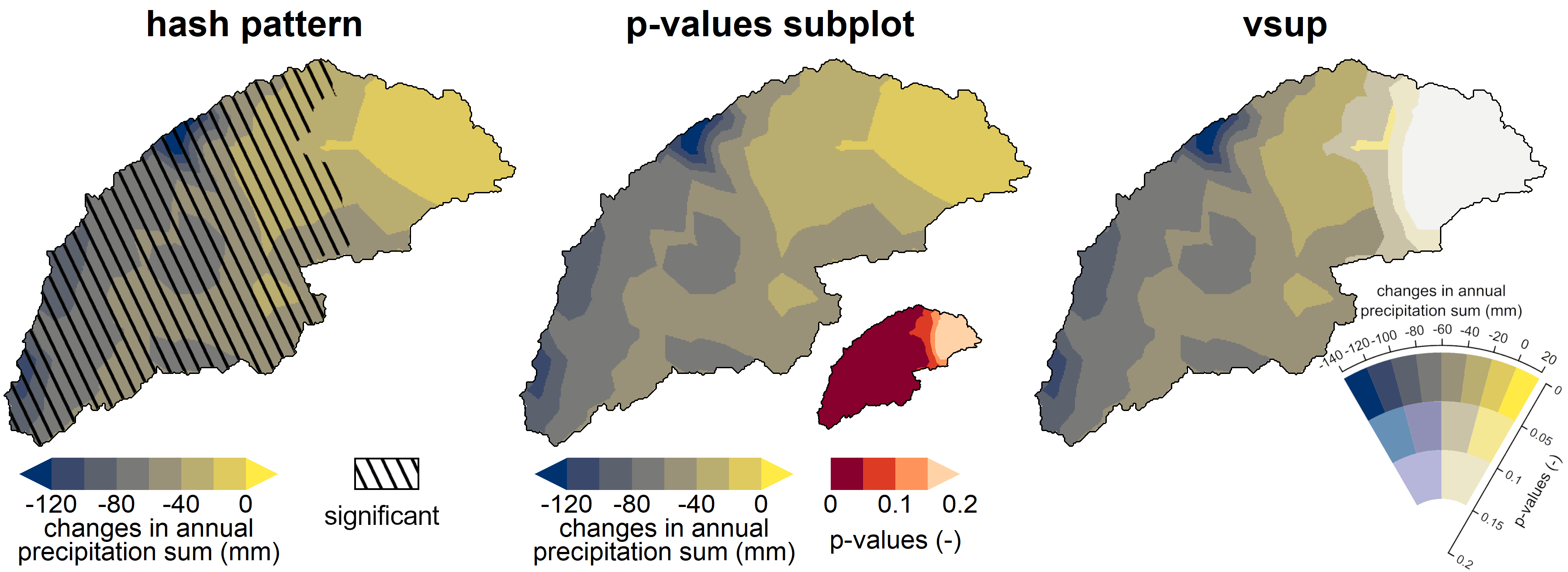
So, we want to show the exact p-values and a map of the ensemble-average model results, how are we going to do this? One way is just to show the ensemble-average on a big map and the p-values on a separate small map, as easy as that. This method I’ve applied in most of my recent papers (although I must admit that I’ve shown the significance in these small maps up to now, I’m sorry, I’ll better my life in the future). In this way, you can clearly see the ensemble-average, without any distortion from an overlay pattern, and you see where uncertainty is high and low. This accounts for both the precipitation and soil loss examples.
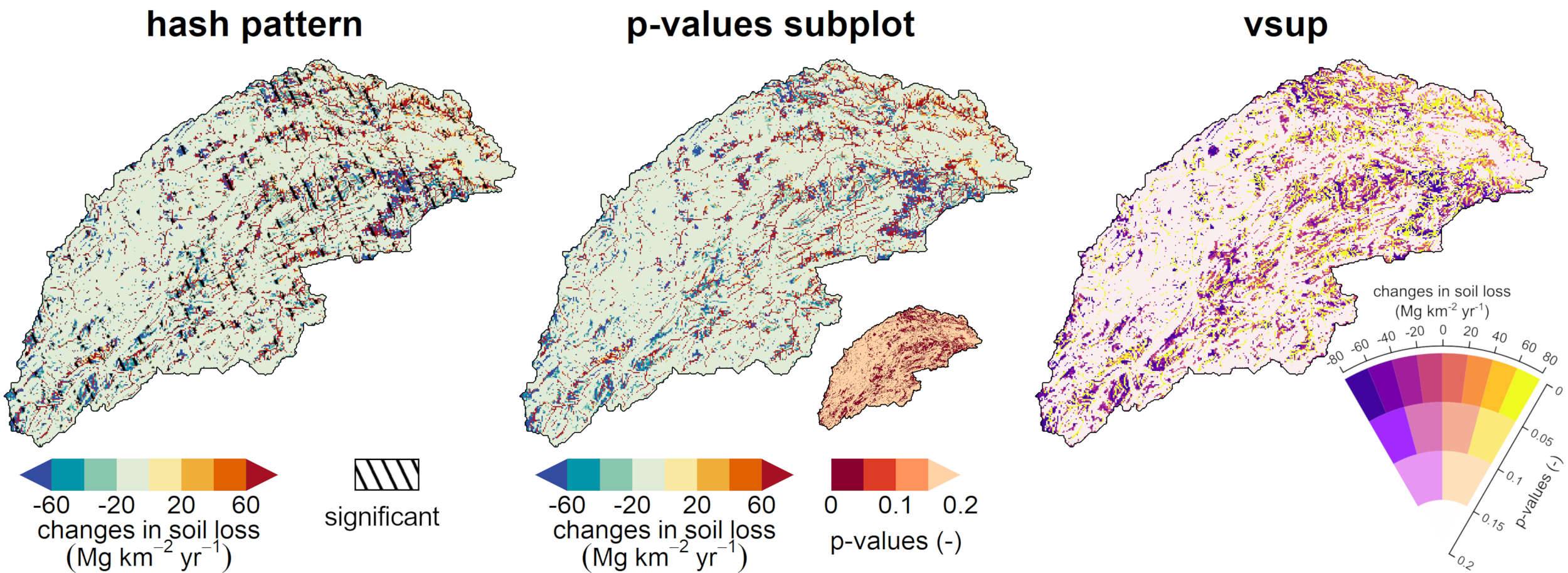
In the two previous methods I’ve used a regular sequential color palette to show the ensemble-average, this is what we are going to change in the third method. For this method I’ve used a so-called value suppressing uncertainty palette (vsup). So what is happening here? The locations with the lowest uncertainty get the same color palette as the two first methods, see the upper part of the vsup legend. But when uncertainty increases, the colors start to fade or, as in the name of the palette, the color values are being suppressed. So in the precipitation example, the colors on the right side of the map are increasingly becoming grayish, that is where uncertainty increases. To me it seems very intuitive what is going on. In the soil loss example it is also very clear that the lightest colors contain the most uncertainty. However, the initial color palette is less intuitive as the one used for the other two methods. Here, the soil loss either increases or decreases, so a diverging color palette is the best way to go. Diverging color palettes always have lighter colors in the center and darker colors on the edges. The vsup method cannot handle such color palettes, therefore, I had to use a less intuitive palette here. Because of this, it is not so clear that the yellow colors indicate an increase of soil loss, while red and orange indicate almost no change. This is a bit tricky.
In this post I’ve introduced three methods to show uncertainty in maps. I would not recommend to use the first method, since it uses a hard threshold to show where results are significant or not. The vsup method is certainly the most elegant of the three, but you need to be aware that you have to make some concessions when you want to use a diverging color palette. With the second method you’ll play it save, since you can show all the data (ensemble-average and statistics), and you have the freedom to use any color palette you like. Although this post touches some statistics, I hope it was not too boring and that you’ll show some uncertainty in your map results in the future!